Columbia Virtual Campus
Columbia Virtual Campus
design lead @ columbia undergraduate research
design lead @ columbia undergraduate research


In direct response to the COVID-19 impact, we created Columbia Virtual Campus to re-build a sense of community, motivate students to find new purposes, and support students who are placed in difficult positions away from campus resources.
goal.
I was the design lead and mentor for a team of 7 junior designers.I lead user research, visual branding, and product design while working extensively with similarly sized engineering and marketing teams.
my role.
DURATION
THE TEAM
March - September 2020
7 Junior Designers, 3 Product Managers, 10 Engineers
PROJECT TYPE
visual design, user research, product design, design leadership, project management

illustrations.
Visual design that sparks playfulness and joy.


From stakeholder and engineering requirements, there were 3 pages that needed to be considered for a design MVP:
Events - to promote and host virtual events
Resources - to consolidate and organize large amounts of virtual resources
Study Spaces - to simulate Columbia’s community online
To ensure we were still serving our target user group, my team interviewed 23 student users, ranging from incoming freshman to new graduates, on how well do they think each page would serve our diverse target student users.
user interviews.
57% of users thought events was useful with some contextual tweaks.
74% of users thought resources was effective with some organization additions.
35% of users thought study spaces could be a feasible and useful tool.
Considering both stakeholder/engineering needs and user research, these are the main issues users have with the current website functions, and where the design team will have the most opportunity to improve the user experience:
1.
2.
Planned for a semester timeline which didn’t match with the abrupt timing of COVID-19 and current product requirement of clubs hosting events on our platform.
There is an abundance of online resources but no way of sorting it or personalizing to a user’s own need.
Study Spaces was too vague and not thoroughly thought out to be useful for users. Several loose ends came up including security measures, user accounts, and community rules enforcement.
The target audience is college students, and so both desktop and mobile views should be prioritized to accommodate their fast paced lifestyle.
From the identified pain points, we focused on the opportunities of developing 3 feature pages.

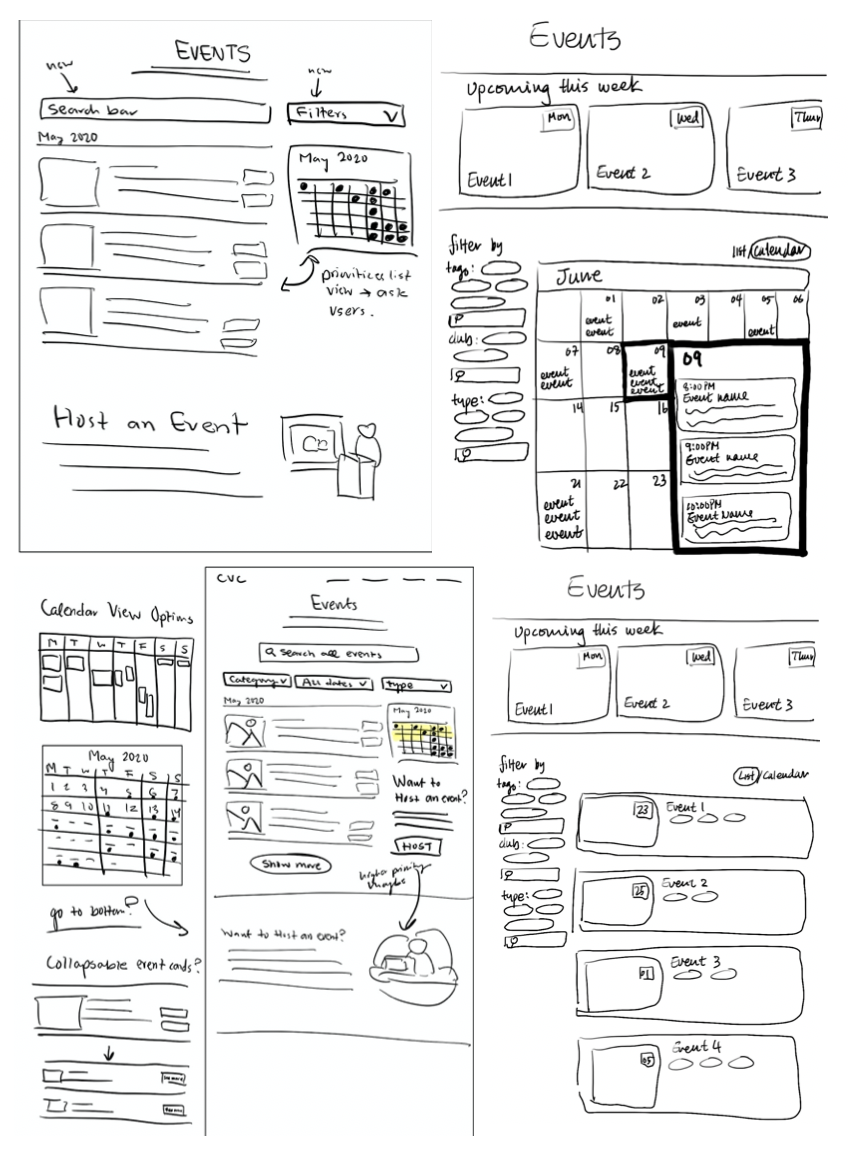
VIRTUAL STUDENT EVENTS
Connect students remotely through campus events and encouraging them to host their own more casually.

ONLINE RESOURCES
Find specific interests resources ranging from Columbia news, career development, social awareness and financial aid.

BLM MENTORSHIP
Replaced study spaces due to lack of user need. Highlight accountability and accessibility through mentorship with Columbia students while donating to BLM programs.
3.
4.
virtual student events.

FUNCTIONAL ORIGINAL
SKETCHES

PROTOTYPING

FINAL DESIGNS

With constant feedback from internal teams and external users, these are the prominent solutions for event spaces:
encourage student-led events: Highlighted the ability for user to host their own casual events. Streamline process with automated form.
organization by user priorities: Use of verified search, filters, and tags make it easier for users to find events of their interests.
ensure video link security: Be transparent with security - zoom links are emailed to Columbia/Barnard affiliates at request to join event only.
1.
2.
3.
4.
minimize calendar: Though helpful for visualizing time, very inefficient in displaying and navigating event information.
collapsable events: Allows user to easily skim many condensed events and click to find more information.
featured events: High level events to promote and capture the users attention right when they enter the page.
colorful theme: Incorporates visual joy and interactive fun in navigating an information heavy space.
5.
6.
7.
online resources.


With constant feedback from internal teams and external users, these are the prominent solutions for resources:
FUNCTIONAL ORIGINAL
SKETCHES
PROTOTYPING
FINAL DESIGNS
1.
2.
3.
4.
streamlined adding resources: Ease and secure the process for users to add self-discovered resources to our shared platform through an automated form.
categorize by user needs: 6 primary categories were identified as well as useful sub-categories such as hidden gems, student deals, and popular resources.
eased user search experience: With 140 resources, users needed to search, filter, sort, and collapse cards to navigate through all options efficiently.
featured resources: High level resources to promote and capture the users attention. Utilized cards rather than a carousel to take up less space / time.
highlighted how resources can help: Changed resource card to answer-response format to identify with users more personally.
integrated joyful interactions: Introduced card flips, category hovers, and sticky navigation to bring some unique joy to an otherwise tedious page.
5.
6.
BLM mentorship.


As a Columbia University affiliated shared platform, our user base is highly ingrained in activism, diversity, and opportunity. To further awareness with sensitivity, CVC drafted a mentorship program where senior/alumni mentors volunteered their time in exchange for their mentees donating to BLM organizations.
With the rapid iteration for the feature release, these were the MVP solutions prioritized:
FUNCTIONAL ORIGINAL
PROTOTYPING
FINAL DESIGNS
1.
2.
3.
4.
accelerated sprint: With the explosive need for activism and awareness, we strived for an extreme MVP approach and shipped out a useful product - ideation, design, engineering - in 2 weeks.
donate what you want: Changing the set $15 donation to any amount attracted lower-commitment users and still encouraged monetary contributions.
reducing space: Users felt that they had to scroll too much to reach useful information. Utilized textual hierarchy to direct the user through information quickly.
donation visualization: Included a donation counter to ensure transparency with our users and provide joy in visualizing success.
emphasized mission: Though our mentorship program is the forefront product, our purpose and confirmation of BLM took highest priority.
simplified sign up: To ease the complicated sign up process as well as donation transparency, manual checks and email communication were quick fixes.
5.
6.
prioritized mentees: Highlighted mentor accolades, organized by fields, and provided step by step instructions on how to participate.
7.
“it’s much easier to navigate through all possible events and interact with the ones I’m interested in.”
“there is a lot less redundant information on the event cards and calendar.”
“it’s much easier to quickly glance and navigate resources specific to my needs.”
My team utilized A/B testing on 14 users to see if the experience of the original design for the events and resources page have improved in the re-design.
success.
Quantitatively, data was collected on the BLM page over the course of 1 month.
Prior engineering leadership advocated for fully building out products before shipping out, following the waterfall method. But after user research, the need to quickly provide a solution to users within a short timeframe became apparent, to take a more MVP approach. Because of this, design thinking transitioned to the agile-waterfall hybrid where our fundamental ideas were fleshed out according to user research but the product experience would be iterated over and over again according to user testing and feedback. Though this method is ideal from a design perspective, it proved much more difficult to communicate, lead and learn about in real time.
learnings.
SUCCESSES
Leadership: Being an entirely student led initiative meant I had to learn to be a Design Lead, create a new brand, and mentor fellow designers extremely rapidly.
Design Driven: Originally, CVC was a primarily engineering focused project - becoming an equal at the table proved a challenge but my perspectives on iterative design and MVP goals provided very fruitful.
Communication: I constantly communicated with engineering leads, program managers, and social outreach to ensure consistency with our goal and promote our product effectively.
insights.
IMPROVEMENTS
User Research: I was able to contribute immensely to high level product decisions and help shape the product hand in hand with the user experience. However, formalizing the user research conducted would have proved more powerful in backing up design decisions.
Remote Collaboration: Being founded after the pandemic came many struggles with working together. There could still be improvements in giving and receiving feedback and transparency in project timelines.
STRUGGLES
Promotion: We struggled with advertising to the larger Columbia community - a stronger and more consistent social media presence, CVC initiated events, and solid branding all helped ease this issue.
81
Mentors
101
Mentees
$1030
Donated
460%
Traffic Increase
7200
New Unique Visits
128%
Social Media Traffic Increase